Looking to make a visual impact with your business or agency but limited in the dollars you have to spend? Don’t worry, there’s an architect for that. Or an interior designer.
They are the folks who will ask you the right questions, determining what you want to catch visitors’ attention as they drive up to the building or when they walk through the front doors.
“That first impression is the key,” said architect Greg Schoer, who joined TSP Inc. in 2010.
Making a visual impact on a budget could mean renovating just one area. That’s what happened at the Zeal Center for Entrepreneurship, an incubator that offers guidance to people developing business concepts. Established in 2004 as the South Dakota Technology Business Center, it expanded in 2009. Three years ago, it proceeded with a remodeling effort to create 2,000 square feet of collaboration space, allowing better interaction among those who keep offices there.
At the same time, officials wanted to rebrand the center. Brenna Wiertzema, one of four interior designers with TSP, helped choose a color palette and select wayfinding elements that work with flooring and lighting selections to help define the space.
“From the moment visitors and potential clients walk into Zeal, they feel the energy that drives it,” she said.
Relatively inexpensive changes included relocating the reception desk to create a focal point. Breakout rooms provide ideal places for small groups to meet, while a nearby workroom offers cabinet storage for office supplies and equipment. An enlarged and updated break room flows into a lounge with soft seating, counter-height tables and booths, offering another space where people can meet and exchange ideas.
Remodeling a business can be both effective and inexpensive when it comes to setting a mood, said Mike Jamison, who works in business development for TSP. He points to a recent renovation at an area church where the priest did much of the labor but turned to TSP for assistance in selecting colors and materials. A few changes created a refreshed worship atmosphere.
“It’s just like in your own home,” he said. “You get used to the colors on the walls or the furniture. Buying a new couch or painting the walls livens up your senses a little bit, enlivens your emotions.”
When working with a limited budget, it often is best to focus on a more narrow area of change rather than water down the project by trying to do too much with not enough, Schoer said. In a renovation project, the owner might decide to create a new facade using higher-end materials rather than spreading it throughout the building. That way, an immediate impact is created.
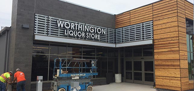
That’s the approach he recently took on the Worthington Liquor Store in Worthington, Minn., which earlier this month moved to an existing building on a different site. City officials had purchased a former Dollar Store building for the municipally owned liquor store. Their goal was a building that would attract more customers and provide a pleasant shopping experience.
“What better way to do that than to create a brand-new facade just in front of the existing former Dollar Store building,” said Schoer, who chose gray block and a warm knotty cedar for the exterior.
His goal was to turn the former Dollar Store into a building that looks like a million bucks, one that makes a positive first impression.
Making a visual impact through building renovations ultimately involves an entire community, he said.
Schoer chose to install large storefront windows that serve multiple purposes. They not only display the product inside to visitors, but the large glass panes also summon memories of the traditional storefront displays that once were common in business districts. Store officials will be able to change the display area with the different seasons.
“You will need to stop by the store throughout the year to see how it may be decorated,” he said. “I’m looking forward to it.”


